Profile overview
Your profile overview is a presentation of your content in Pure. The overview is dynamic and interactive. This means that the overview is updated as you add or remove content in Pure. It is also possible to click on items and see the details behind e.g. a number or a particular piece of content.
Please note that Pure does not support Internet Explorer. If you use Internet Explorer, you may experience problems with viewing the profile list.
Profile information
Profile information
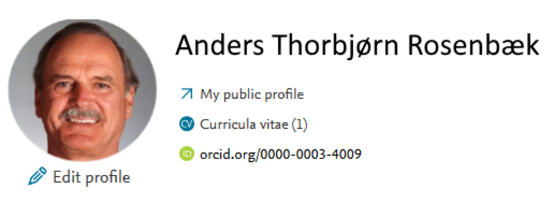
This sections displays your primary profile information. Included are direct links to give you easy access to your AU personal profile page and your CV (if you have created a CV).
If you want to update your profile information e.g. your Scopus author-ID, profile image, academic qualification, you edit these by clicking "Edit profile".
PlumX metrics
PlumX metrics
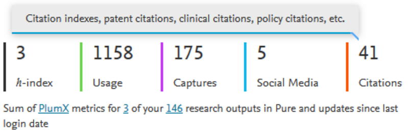
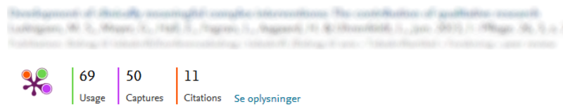
This section shows summaries of all your research output with associated PlumX metrics. If there are changes in the metrics between logins, the changes are shown above the total for each metric.
It will look like this. ![]()
The are blue text links embedded in the text below the metrics. Click on the blue "PlumX" if you want to read more about the PlumX metrics. If you click on what corresponds to "3" in the example you will get a list of outputs in Pure that have associated PlumX metrics. Clicking on the other number (146 in the example) you will get a list of all your publications registered in Pure.
If you want to know more about metrics in Pure, you can read about it here.
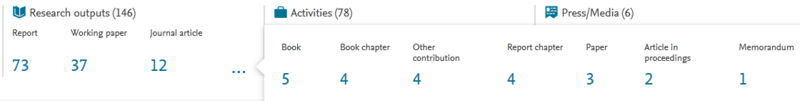
Content inventory
Content inventory
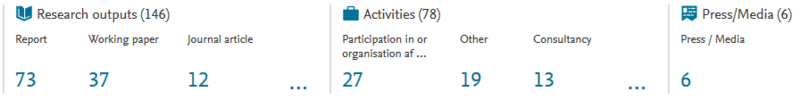
The content inventory is a summary of all your content in Pure, and shows how it is distributed across output categories. The categories are the same as the categories (templates) you use when adding content to Pure.
The total count of items is shown for main categories and subcategories. You can click on a category or subcategory to see the list of publications and activities it contains.
Projects
Projects
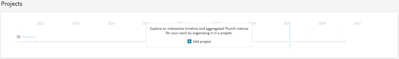
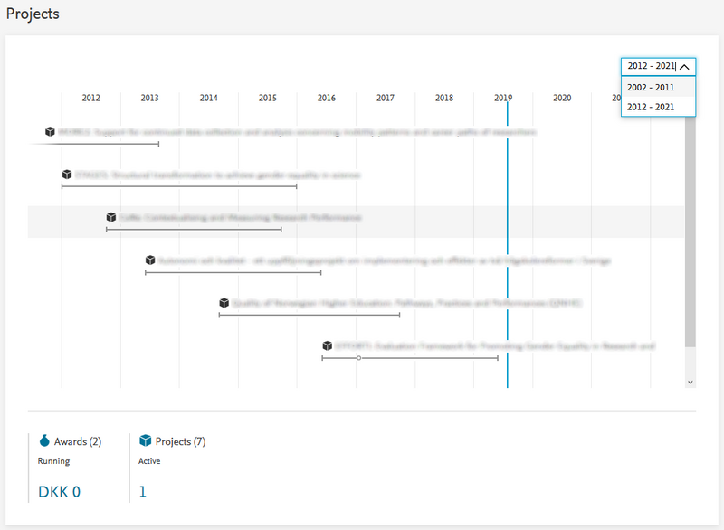
If you are associated with one or more projects in Pure, the projects are shown in an overview with a timeline for each project. If the overview covers several year, you have the option to select a specific period in the drop-down menu in the top-right corner.
Projects are sorted by start date. A project's timeline ends with an ellipsis if there is no set end date. Projects without a start and end date only show the title.
Below the project overview there is summary of your awards and number of projects that you are related to. If you click on items, your will get a list of awards, of all your projects, or all your active projects respectively.

The overview is interactive and enables you to directly access content related to a project.
If you click on a project name a window will open and display further project details including project participants, PlumX summary for research output related to the project, the project's timeline with specific dates (if available).
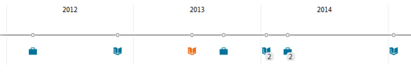
Associated activities and publications are shown as icons on the project timeline.
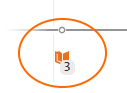
If you click on an icon, e.g. for publications as shown in the example, you will get a window with the list of publications. You can click further on the publication title to see the publication details.
If the publications are indexed in Plum, the PlumX metrics are shown.
Tasks
Tasks
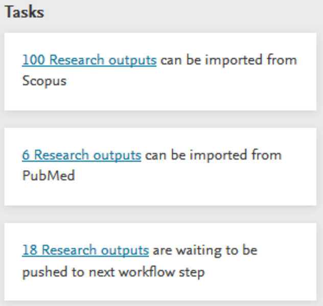
On the right-hand side of your profile overview, you get task notifications. A notification may be a suggestion to import a publication from an external source, or a message that a publication is waiting to be moved to the next step in the submission process.
If you click on the link in the task, you will see the list of publications that requires further action.
Notifications
Notifications

When somebody relates content to you in Pure, the system automatically send you a notification. The notification are shown on the right-hand side of the profile overview beneath "Tasks". If you have a large number of tasks, you can load more by addressing (Got it!) or dismissing (Not mine) current notifications. You can use the same method to empty or clean up the list.
Messages are shown in date-descending order. Messages older than 6 months will be automatically removed.
In 2019 the message layout was changed. Therefore, older messages may have a different look. Both layouts give access to the same information.
Research network
Research network

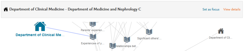
The network map makes it easy to decipher with whom and how you are related to other researchers, institutions, publications etc. The network map is interactive and provides rich options to explore your relations and see them from different perspectives.
You can organize the map in different ways.
![]()
"Set me as focus" places you as the midpoint of the network. "Arrange" distributes the map elements in an organized fashion. additionally, you can zoom in and out, depending on where you want to focus.
By clicking on the map and hold down the mouse button you can drag the map around to the position in the window that you desire.
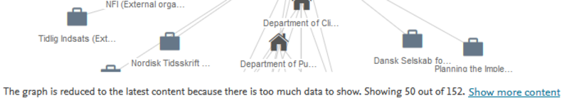
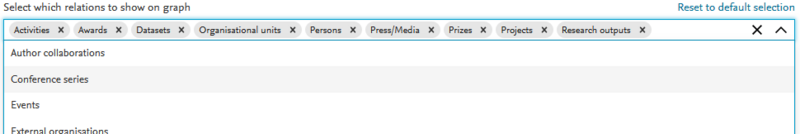
Relation types can be filtered using the filters below the network map window. You select or deselect filters depending on what content you want included in your research network map. If you click on the down-arrow to the right, a list with more filters expands. On this list, you can also find entities that you have previously deselected. If you want to start all over, just click on "Reset to default selection", and the map will change back to the original setting.
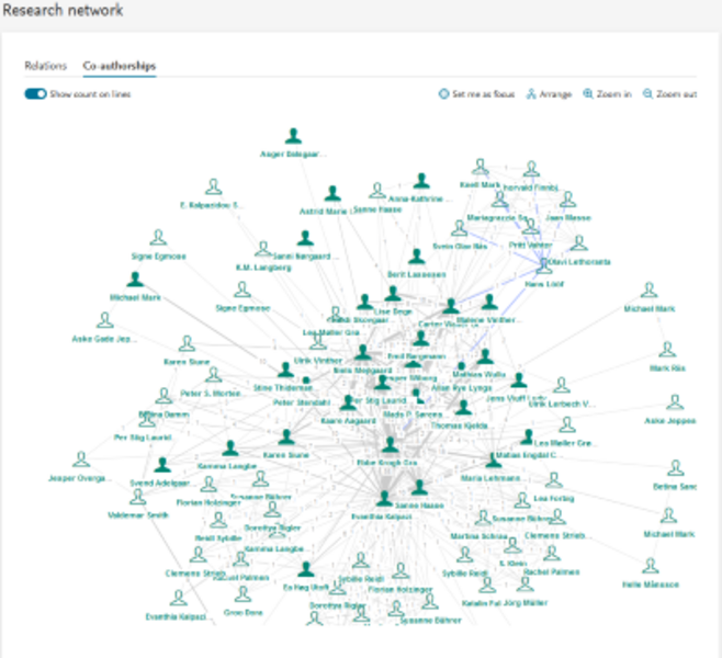
The co-authorship tab features a network map with only relations to your co-authors. There are no further filtering options for this map. You still have the same options, as you have with the "Relations" map, to arrange the map within the frame.
![]()
Your most frequent co-authors are shown with icons. If you want to see how many relations to have to each co-author, use the toggle switch
![]()
If your network is quite expansive, it may make sense not to show count on line till you have zoom in on a particular area in the map. Otherwise the map might appear very cluttered.
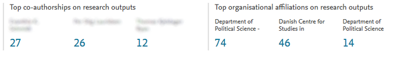
To help you identify your top relations, there is an inventory overview below the network map. The network inventory highlights your frequent collaborating persons, and your most frequent organizational affiliations listed in the research outputs.
If you click on a metric, you will be presented with the overview of all your research outputs related to that person or organization.