Logo
Aarhus University’s logo consists of a mark and a logotype.
- The logo consists of two letters – A and U – from the fifth element, the abstract alphabet AU Peto.
- The logotype is written in the AU Passata font and is placed under or to the right of the mark. The choice of logotype depends on the overall look of the publication and the space available around the mark.
- The mark and the logotype can not be separated.
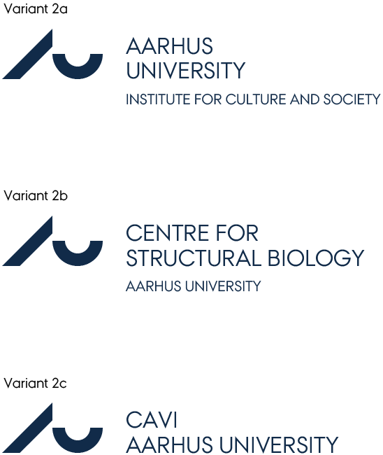
The primary logo has two variants, where the second has the possibility to add a department name or faculty name.

The names of the academic units at AU can be integrated into the AU logo which means that the mark, the logotype and the name of the unit can be presented together. There are three ways of integrating names of academic units into the AU logo:

However, variant 2C will only be used for fairly short unit names instead of using variant 2B.
Faculties
At Health, Natural Sciences and Technical Sciences, the deans have decided to use variant 2a. The units at Arts will use variant 2b. At Arts, variant 2c will be used for fairly short unit names and for the faculty. Aarhus BSS will use a separate system for logos.
The central administration
In addition to the guidelines for design and naming at AU, the following applies to the central administration. In the central administration, all units must use AU’s letterhead logo without placing the unit name underneath. Special logos for sub-units or projects are not used.
The four administrative centres follow the guidelines for the faculty in question.
Positioning of logo
Positioning
The general rule is that the AU logo should be positioned in the top left corner or the bottom left corner.
Minimum distance
- The minimum distance around the AU logo ensures that no elements appear too close to the logo.
- The minimum distance is 12 pt around the entire logo when the logo size is 100%.
File format
PNG
PNG logos are pixel-based and suitable for use in MS Office programs. For best results, the logo must be inserted in its original size (100%).
PDF og EPS
.pdf- og .eps logos are scalable vector-based files, suitable for use in professional layout programs such as Adobe InDesign, and when material is being used for print production (300dpi).
Logo colours
Principles have been defined for coloured versions of the AU logo.
Here, a distinction is made between three variants:
- AU logo as the main logo.
- AU logo with a main academic area as the sender.
- AU logo with a department/institute/centre/section as the sender.
- In the paper line, all three variants are always reproduced in the AU-blue colour.
- In publications created in Word, the three variants are always presented in AU-blue, black or white
- In publications created in DTP programs, e.g. InDesign, the first variant may be presented in any of the colours from the colour palette.
Variants 2 and 3 may only be presented in AU-blue, black or white.
Logo sizes
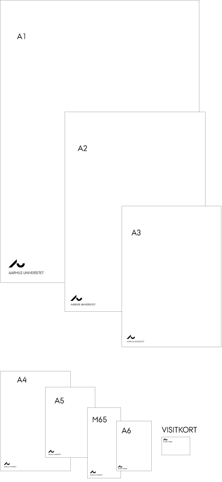
The AU logo is generally defined in a single size (100%). The logo is scaled up or down in size depending on the format of the individual medium.
Logo sizes for a variety of formats are listed below:
- A1 (e.g. poster): 283%
- A2 (e.g. poster): 200%
- A3 (e.g. poster, newspaper): 141%
- A4 (e.g. publication, letter): 100%
- A5 (e.g. publication, map): 100%
- A6 (e.g. postcard, pixibook): 75%
- M65 (e.g. publication, map): 100%
- Business card (85 mm x 55 mm): 75%

Secondary logo
Primary and secondary logos
As a general rule, all staff and units at Aarhus University use the primary logo (letterhead logo). AU wants to act and be perceived as a unified organisation.
AU particularly wants to promote the large interdisciplinary centres, which is in line with its interdisciplinary focus. These centres can therefore use the secondary logo, if desired.
Positioning of secondary logo
- The secondary logo never appears on its own, but always together with the primary logo.
- The primary and secondary logos must not be positioned so close to together that they appear as a single logo, and the secondary logo must not be graphically dominant.
- The general rule is that the AU logo should be positioned in the top left corner or the bottom left corner.
- Secondary logos are generally positioned in the bottom right corner.
New secondary logos
All new secondary logos for particular centres are designed by AU Communication, which ensures that the secondary logos are graphically aligned with the primary logo and of the right quality. In addition, the logos are designed to fit the relevant formats (negative and for use in various formats, including AU's standard letterhead), and they are made available for download from the website.
The aim is generally to reduce the number of secondary logos at AU. For historical reasons, there are already more than 100 different secondary logos at AU, and it is quite costly to maintain so many different logos for such a wide variety of media types and platforms – compared with the primary logo, which has a built-in flexibility in that names of departments and institutes can be positioned underneath, and the logo can be generated automatically.
Special circumstances
- In very special circumstances, more advanced graphic elements may be needed, which requires the services of a professional graphic designer. If this is the case, contact AU Communication.
- Special circumstances include the use of older secondary logos (i.e. dating from before 9 March 2011) and logos for interdisciplinary centres.
Partner logo
General
Aarhus University is part of a number of close partnerships where joint publications and websites require the use of multiple logos. It is important to ensure that all partner logos are used in line with the partners' design guidelines. If in doubt about how to use partner logos or the AU logo in joint publications, please contact AU Communication.
The most common partners are:
Central Denmark Region
Aarhus University Hospital uses the Central Denmark Region logo.

City of Aarhus brand
The City of Aarhus brand logo is an open source. Get the logo from the City of Aarhus brand logo generator.
See also citybrandaarhus.dk
The Danish Accreditation Institution (ACE)
The Danish Accreditation Institution (ACE) logo can be obtained from ACE.
Download logos
Download a package with the most common AU logos. The package is build as follows:
- DK / UK
- BLUE / BLACK / WHITE (TRANSPARENT BACKGROUND)
- PDF / EPS / PNG
The .png-file is used when setting up your email signature - read more about setting up your signautre for AU and Aarhus BSS
Logo generator
Do you need the AU logo with the name of your department or faculty, or is the logo not listed below? Then use the logo generator.
